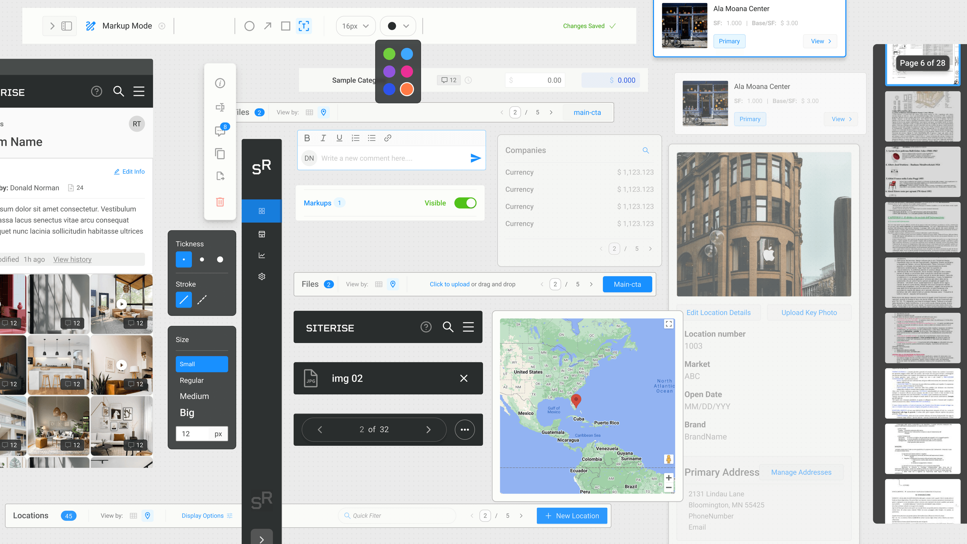
To provide a consistent and scalable user experience, we established the fundamentals of interaction through a design system. This system was created to address current requirements, adapt to future needs, and streamline the development of new components. It aligns with the development team’s technology stack, ensuring a user experience that is both sustainable and scalable.
The design system is built on three key pillars:
-
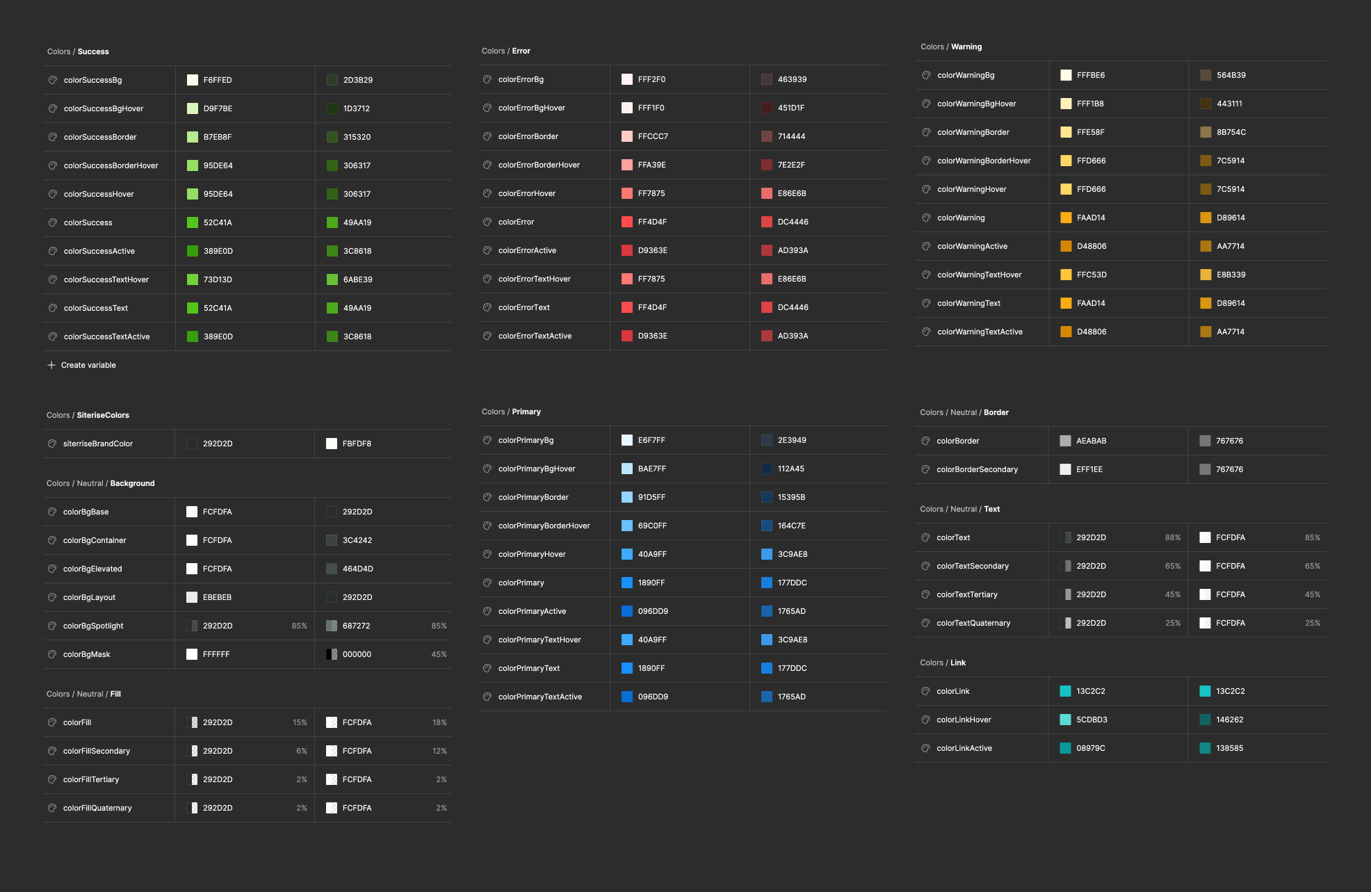
Tokens:
These are design variables such as colors, typography, and spacing that ensure visual consistency across the platform.
-
Patterns:
Reusable design solutions for common problems, such as navigation structures and form layouts, that help maintain usability and coherence.
-
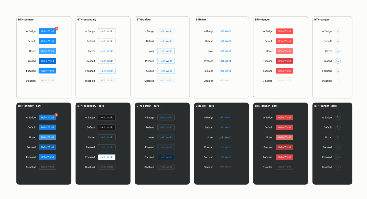
Components:
Modular elements like buttons and input fields that are used to build the user interface, ensuring uniformity in functionality and appearance.
Understanding the context and goals for each feature is crucial to selecting and applying the appropriate components. This approach enabled us to:
-
Rapidly develop interaction patterns that resolved complex user behaviors.
-
Implement both dark and light themes to enhance user experience.
-
Evolve the product by continuously adding new components and patterns as new functionalities were introduced.
This strategic use of a design system helped streamline our design process, improved consistency across the platform, and supported future scalability.